First iteration
Through this course, I would like to investigate how we visualize segregation in rural American spaces. Following suit, my project for this course will use my hometown of Saginaw, Michigan as a case study, showing where people of color live in Saginaw and what their living conditions look like from an infrastructure standpoint. This project will incorporate US Census data from 2010 and apply the data to visual elements, including but not limited to a map with interactive photographic elements.
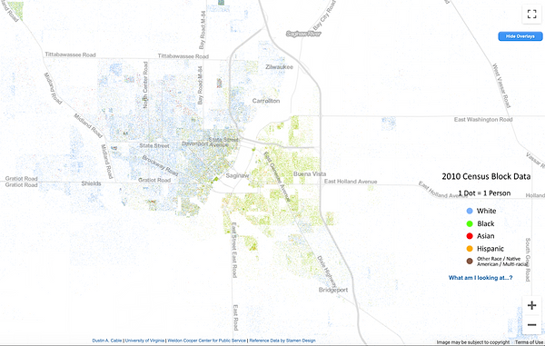
My captaset for this project is as follows and is actively evolving-- I will be using the Racial Dot Map as my capta for this project, meaning the case study will be specific to the data of Saginaw collected through the 2010 Census. This capta is being collected on my behalf by using the Racial Dot Map and counting/recording the output information about where people lived by race. In layman’s terms, I will myself be counting the individual dots and recording their location to use as my capta; I am doing this by following the city and county limits of Saginaw and recording accordingly. This captaset is in progress. As I am aware of the potential lapses in information that could arise from this secondary use of a primary source, I am also incorporating and contextualizing the capta I collect from the Racial Dot Map with the source information itself-- meaning I want to contextualize the RDM captaset with figures from the 2010 Census data, including the total population sizes of the city, specific demographics, etc. I am also hoping that by my next iteration I can also use the 2010 Census data to contextualize class information with my captaset if possible.
As someone who has grown up a person of color in the lower-class of rural America, my experience has exclusively witnessed the racial divide that exists in these spaces. Yet, upon going to college in Chicago (a Midwest urban space that is also largely affected by segregation), I found it hard to articulate segregation to people whose terms of segregation looked a specific way (ie. Chicago’s north versus south sides). Digital humanities offers the opportunity to articulate the nuances of these segregated rural spaces by offering visual aides where these differences couldn’t otherwise be articulated. The visual elements provided in this project, including the racialized/class-conscious map and interactive photographs, offer the opportunity to show this space as I experienced it which, I reiterate, was a visibly racist environment.
My Mindful Practice Journal showed that I have a lot of learning to do and should reach out for more help. I enjoyed learning the tools we practiced so far this semester but feel that I am far behind a curve merely because this is my first introduction to so many of these digital tools (for example, I didn’t have a hard time learning about coding but do feel overwhelmed by the possibilities of coding in context to the little that I now know). This feeling carried over to my work on this project-- I sometimes struggle to locate and then navigate resources about the Census data, and even when working with the data I struggle to get the information I want from it. During the next phase of this project, I want to utilize the library Digital Scholarship Services to help me better understand the resources I am working with and how to get from them the information I need to fully realize my captaset.
SECOND iteration
Since my last iteration, I have determined that visualizing segregation in rural America can mean more than just showing a map of cities’ racial breakdowns. Analyzing the experience of living in segregated rural America can provide us with new capta that visually depicts segregation. For this iteration, I have decided to use my own lived experience as a case study and have generated more signifiers of racism in rural America, thus expanding my captaset to align with the answers of my generated questions. I have also identified the scope of my project-- I believe there to be six iterations of segregation existent in Michigan, of which I have defined through small towns (such as Saginaw, Midland, and Bay City), isolated towns (such as Unionville), big cities (such as Kalamazoo and Flint), and elite/high-income areas (such as Ann Arbor and lakeside cities like South Haven). I am interested in taking on the latter mentioned types of towns in the future, but for this semester I want to stick to my small town case study and am hoping to cover Saginaw fully, and if time permits Bay City and/or Midland.
As mentioned, I have generated new lines of inquiry that will help me create a visual representation of segregation in rural America. For this stage, my process involved spending time thinking of the ways I believe I have experienced racism/classism in rural America; I also spent time learning about the history of segregation in rural America, and was able to find redlining maps of the cities I am researching; as well as locating information about Michigan listed in The Green Book, a guidebook for Black Americans (but also used by other people of color) that identified towns and businesses that welcomed people of color. Adjacent to completing this research I was also able to speak with my grandpa (a first-generation Mexican American man) about his experiences with The Green Book and racism while traveling in Michigan, broadly. It could be interesting to include oral histories of lived experiences of people of color in rural America should time permit.
I used my journal to compile my thoughts and research to identify signifiers. Through my research and self-assessment, I have generated the following list of signifiers that I will apply to the town I am working on:
-
(included in first iteration) Racial makeup of town (as identified through Census data, see Racial Dot Map)
-
Redlining histories
-
Income
-
Wealth gaps
-
Identifying which neighborhoods have wealthier constituents
-
-
Politics
-
Voting trends
-
Gerrymandering
-
Volume of Trump signs per block
-
-
Public housing facilities
-
Locations
-
History of their development
-
Demographics
-
-
Public schools
-
Racial makeup of schools
-
School budgets
-
It is important to remember that the outlined signifiers will read differently depending on the location of their information, and as this project progresses my hope is that comparisons and contrasts can be drawn from seeing how the signifiers show up in multiple cities (sometimes cities even within 10 miles of each other). I also want to state my awareness of the large scope of these questions, and hope to answer them qualitatively, and if needed I will eliminate some larger bullet points.
I have yet to decide a fair way of including data about signifiers like Trump signs, as I can’t travel the entire town but want to demonstrate the visibility (and hypervisibility, depending on area) of those politics. I have determined that I will collect this data the day before the election so as to try to get the most accurate results, but am open to suggestions on how to determine a path for collecting this data. Second, the inclusion of this signifier is not aimed at creating a bias. When researching about the Green Book, I found that many towns that were unwelcoming to people of color (also known as “sundown towns”) often had their own signifiers of white supremacy, including “KKK” initials in businesses as well as more blunt examples of handmade signs with racial slurs. Provided Michigan’s recent event wherein a group of white supremacists plotted to kidnap and murder Governor Gretchen Whitmer over the statewide lockdown COVID-19 response, of which was encouraged by President Donald Trump in the early stages, I included the signs as, for many people of color, they are frequent reminders of the politics (and white supremacy/domestic terrorism) of those around them (of which are often the majority).

Yard sign I've seen throughout Michigan since May, 2020. Image courtesy of Ebay.
This final project will look like an interactive map with layers that can be added and subtracted, as well as interactive features that allow the viewer to look closer at specific areas (for example, if a viewer is looking at the map with the layers of redling maps and the racial makeup map on, they can click on the area that is primarily white populated and find information about school districts, see photos of streets, etc). So far, I have started working with ArcGIS to create map layers, but may need to move to storycorp once my layers are finished to add the interactive elements. I was happy to find that others have used ArcGIS to transfer data from the Racial Dot Map, and many of which were doing so to think about questions I am also considering, such as redlining, racial distribution among communities, and poverty.
final iteration
ARCGIS map layer: https://arcg.is/mj5eL
Storymap: https://arcg.is/0e5D5S0
The full narrative map can be viewed in Storymap. My recommendation for best legibility would be to look at the map’s layers individually using ArcGIS, then engaging with the Storymap. The legend for the ArcGIS map is as follows:
-
Purple hues = Racial makeup information
-
Dark purple: 25-50% POC population
-
Purple: 10-25% POC population
-
Light purple: less than 10% POC population
-
-
Red/Yellow/Blue/Green = Redlining districts (colors and legend directly from original map)
-
Green: Best
-
Blue: Still desirable
-
Yellow: Definitely declining
-
Red: Hazardous
-
The Bay City, Michigan of the 1800s was vibrant and promising. Fuelled by the lumber industry, the town was rapidly developing. When working a co-op position at the Bay County Historical Society in high school, I heard repeatedly in tours that Bay City was poised to be the next Chicago. This explained why the small town had so many historic buildings, but the economic turmoil of the tumultuous 1900s would not have been expected by those same developers.
Like much of Michigan and the American Rust Belt, largely, Bay City has endured multiple failures of large-scale capitalism. With no local economies comparable to the successes of the lumber and auto industries, Bay City has recessed and continues to decline save modest new developments. The city’s impoverished population is 38.8% higher than the state’s average, and the population has steadily declined since the 1990s. In addition to economic struggles, most of the city’s small population of color lives segregated both racially and economically, as much of the city’s wealthiest constituents live in concentrated areas.
This project attempts to visually represent the current discrepancies of class and race that are a result of the economic and racial shortcomings of its history. This thesis is reflected in the visual representations of where people of color live currently; where white people were encouraged to live according to the city’s redlining maps of 1940; representations of current home values in each redlined area; and through photographs reflective of my experiences in the city.
This concluding project is not what I had originally envisioned I’d be submitting. While there are real inequalities taking place in Bay City, Michigan is littered with cities of similar histories. I, originally, wanted to tackle the city of Saginaw for this project, but found the scope of doing a case study there would be too large. Saginaw is bigger than Bay City in population and size, and has a much higher population of color, especially of Black and Latinx residents. Saginaw is where I was born, as was my mom’s side of the family, and I spent a lot of time there growing up. The inequities in Saginaw are, I believe, far greater than what is experienced by people of color in Bay City (which was the reason my mom sent me to public school in Bay City, and why her dad also sent her to school in Bay City). Black and Latinx people are concentrated in neighborhoods of historically low property value, which can be traced to the city’s redlining history like in Bay City.
Using Bay City for my project this semester has been helpful in forming ideas for how I can adapt the project to include Saginaw. As mentioned in a previous iteration, I would also hope to do case studies of cities throughout Michigan.
Although this project has shifted many times throughout the semester, I am happy with the final result. My mindful practice journal documented my frustrations with myself throughout the semester, but now looking back I realize these frustrations were a result of not adapting the project to a more abstract form sooner. At the beginning of the semester, I was very interested (and still am) in statistical information as a means of justifying why these systemic inequalities happen. Multiple times throughout the semester, however, I came across databases that were difficult to comprehend, and this discrepancy made me worried that my final product would not be as credible if the statistics were left out.
The syllabus of this course did, however, mitigate my frustrations. I am grateful to have been introduced to the entire digital realm (not just digital humanities) through this class because the holistic approach to computer science and its theory was much more accessible to me than a binary way of thinking of computers. As a self proclaimed right-brainer, knowing that I can get results from computers in a format that makes sense to me was more than a relief.
I do, however, wonder and worry if my methods, and the methods of others that use digital humanities in abstract forms, are translatable beyond humanities circles. I can look at my project and draw inferences of race and class among the visual experience of the represented space, but can others? It is through this question that I want to return to the challenges I faced at the beginning of the project--a future goal for myself would be to learn how to navigate and interpret data for the sake of strengthening my arguments, visual or otherwise.
With this in mind, I also do have a larger worry that, data inclusion aside, I may not have fully realized my thesis question, which at the beginning of the semester was “how do we visualize segregation in rural America?” Perhaps it is because I know Saginaw would have been a better argument regarding race, but I was, nonetheless, surprised by the smaller scale racist incidents that working with these documents showed me. I’ve also recently pondered the possibility that class is intertwined with the segregated experience, or that a contemporary version of segregation might exist in the ways Americans live separated by class. Nonetheless, the Bay City case study does offer useful insights on the lived experience of those far outnumbered racially-- and there are still strong visual arguments about race throughout the Bay City case study, especially in seeing how people of color are landlocked and (if this is a word) moneylocked.
Sources:
Bay City Central student economic demographics: https://www.mischooldata.org/school-entity-view-page/?LocationCode=00227
Garber High School student economic demographics: https://www.mischooldata.org/school-entity-view-page/?LocationCode=01358
Central history: https://baycitycentral.com/about-us
Garber history: https://www.e-hps.net/about-garber
Masonic Temple history: https://hmtbc.org/history/
Chuck's Market: https://www.mlive.com/news/saginaw-bay-city/2020/01/chuckies-restaurant-owner-laments-proposed-sale-of-bay-county-market.html